In the ideal co-mingling of old and new architecture, the sum is greater than its parts. Smart adaptive-reuse projects employ the best contemporary design to showcase architectural heritage. They also breathe new life into the past, providing new uses, new contexts and new ways of experiencing the urban landscape. In some cases, adaptive reuse recasts buildings in unimaginably different roles — stables transforming into homes, industrial buildings turning into community hubs.
In the best examples — say, the 1989 addition of I.M. Pei’s glass pyramid to the Louvre in Paris, a building whose history goes back to the 12th century — it is the conversation between the old and new that itself becomes iconic. These six exemplary buildings from around the world prove that the past can find new life in designs built for the future.
PORT HOUSE
Years built: 1911, 2016
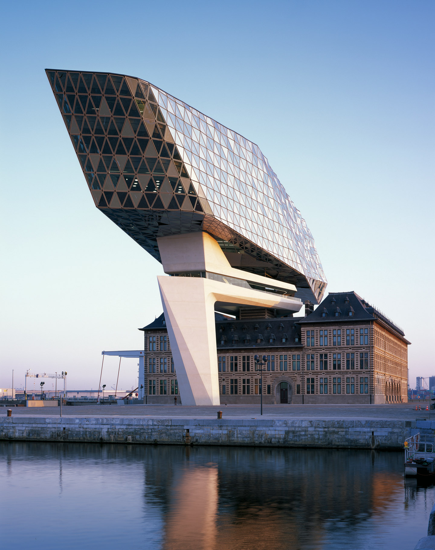
Architects: ZAHA HADID ARCHITECTSThe brief: In one of her firm’s last projects before her death in 2016, London-based Zaha Hadid was tasked with creating a modern space that would bring approximately 500 of Antwerp’s Port Authority employees together in a single waterfront headquarters. Hadid was required to preserve the site’s existing century-old fire brigade building, which is a replica of a Hanseatic house, a style popular in Nordic countries in the 1600s. Her solution was to balance a five-storey glass-and-aluminum structure atop the roof of the heritage building. Visible from all directions, with a commanding view of the busy harbour, the extension’s unusual shape, made of 2,000 triangular glass panels, has been compared to a ship, diamond or piece of lumber. The bridge connecting the old wing and new cleverly uses the base for a tower that was planned for the original building but never built. The adjacent square was renamed Zaha Hadidplein, or Zaha Hadid Square, to recognize the architectural achievement.
SPACE ASIA HUB
Years built: Early 1900’s, 2011
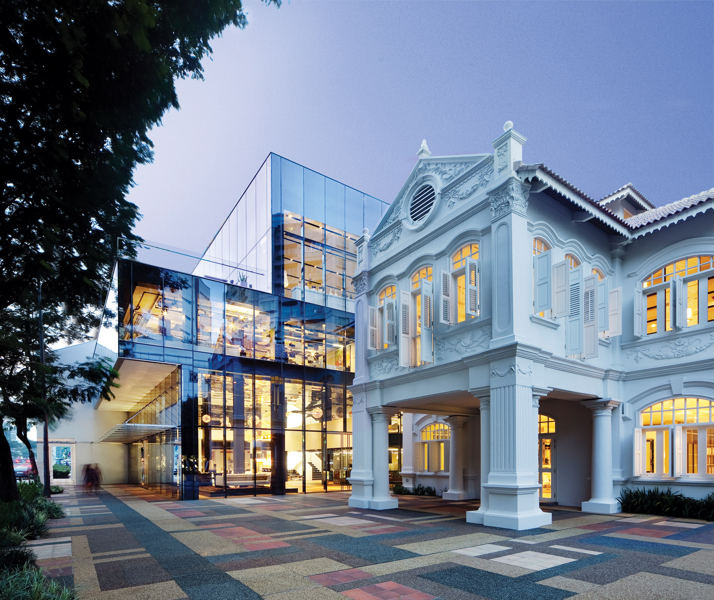
Architects: WOHAThe brief: Singapore-based WOHA architects have projects dotted all around the firm’s hometown, but none quite so spectacular as the flagship retail location they designed for Space, an Australian-based furniture company. This ultramodern city-state frequently struggles to preserve its past, and the site’s pre-war villa and shophouse were the last of their kind on the street, which is now an arts and entertainment district. The architects lovingly pre- served the white-painted façades of the former bakery and former hotel, as well as the Malay- style timber fretwork in the balustrades, eaves and fascia boards. But inside is a different story. WOHA opened up the space to create grand column-free showrooms, and rear walls were removed to seamlessly connect the buildings to an impressive glass cube structure, contrasting brick against glass, and steel beams against timber. A living green wall enlivens a courtyard beside the conserved shophouse.
CAIXAFORUM MADRID
Years built: 1900, 2008
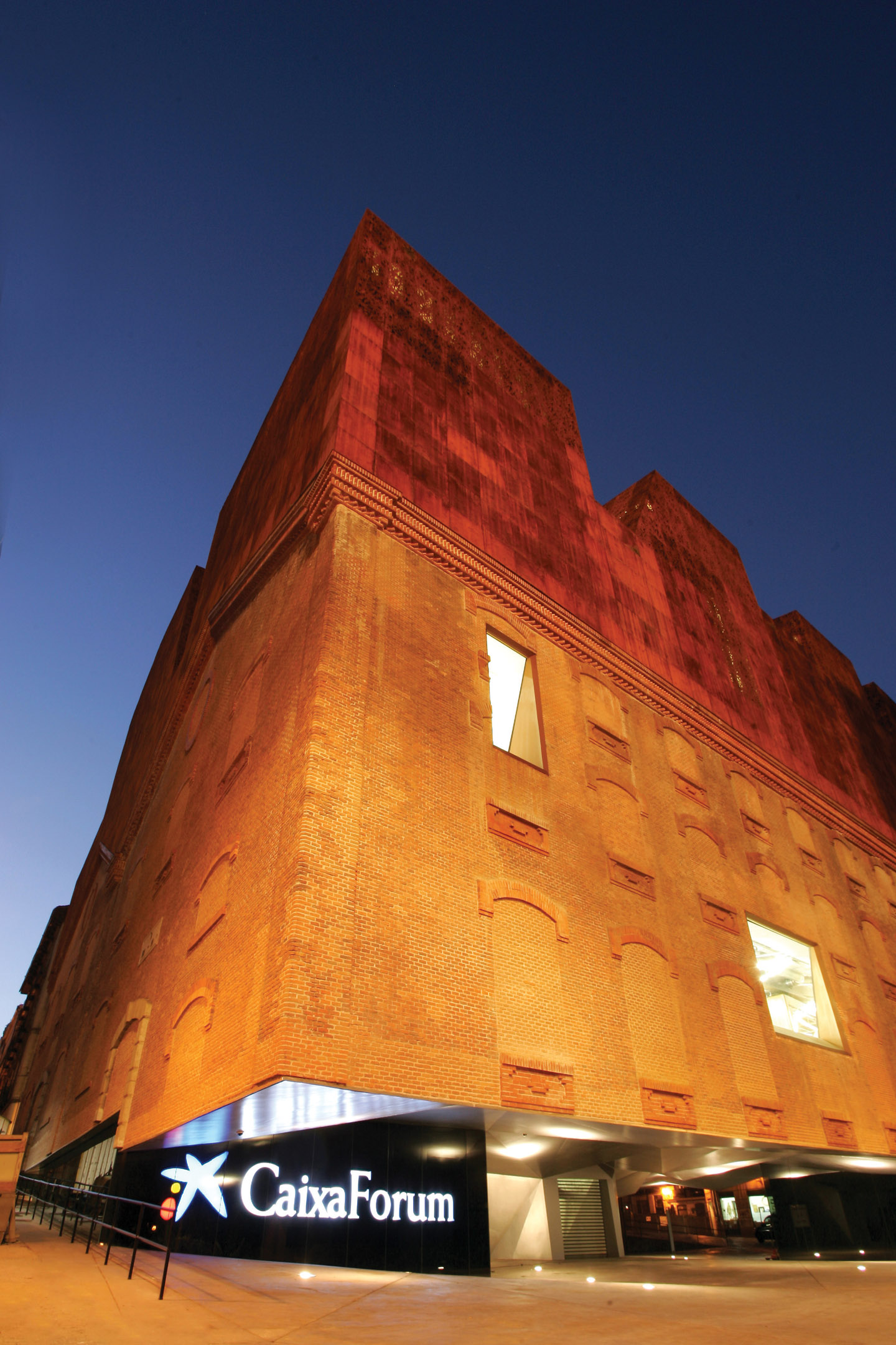
Architects: HERZOG & DE MEURONThe brief: Originally built as a coal-powered electrical plant, the decidedly functional Mediodía Power Station in Madrid occupied a highly coveted location on the city’s Paseo del Prado art walk. Swiss architects Jacques Herzog and Pierre de Meuron, famous for their 1990s transformation of London’s Bankside Power Station into the Tate Modern, were the perfect visionaries for the building’s rebirth as 21st-century sociocultural centre. With the base of the old brick building removed, visitors strolling into a plaza underneath can look up at the build- ing’s underbelly, which resembles folded origami paper. An Antoni Gaudí–style staircase leads to upper galleries in a compact new structure that sits comfortably atop the old power station, echoing the shape of the old build- ing. The orange-hued oxidized cast-iron exterior of the new reminds passersby of the building’s industrial past, while contrasting with its neighbouring building’s green wall, designed by French botanist Patrick Blanc.
GASOMETER CITY
Years built: 1896-1899, 2001
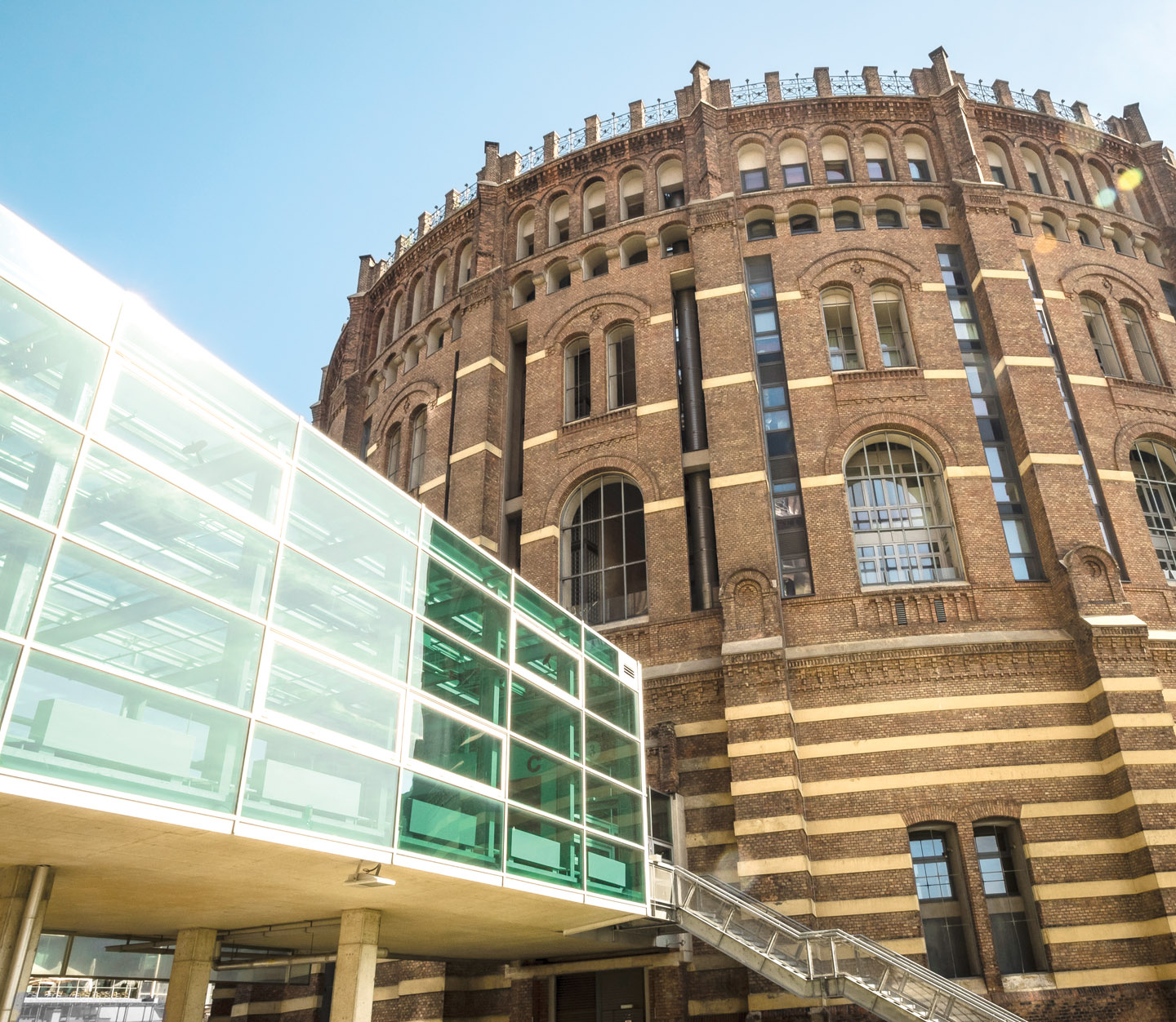
Architects: FRANZ KAPAUN, JEAN NOUVEL, COOP HIMMELBLAU, MANFRED WEHDORN, WILHELM HOLZBAUERThe brief: In the 1990s, four identical massive 19th-century cylinders built for storing gas were assigned to four architecture studios to repurpose into a game-changing mixed-use community. From the outside, Gasometer City still conveys industrial-age sturdiness. Inside, the city- within-a-city houses hundreds of apartments and student dormitories, the Vienna National Archive, a daycare centre, a cinema, an events hall and an array of shops, restaurants and cafés. Each architectural team adopted a different approach and style inside the 15-storey-high structures. (Enough to hold 34 Olympic-size swim- ming pools of liquid.) Studio Coop Himmelblau added a 22-storey modern glass tower “shield” that lean against their cylinder. Jean Nouvel centred everything on an airy indoor plaza. Manfred Wehdorn built an eco-friendly terraced structure, while Wilhelm Holzbauer created a central block that forms a series of interior courtyards.
HEARST TOWER
Years built: 1928, 2006
Architects: JOSEPH URBAN, FOSTER & PARTNERS
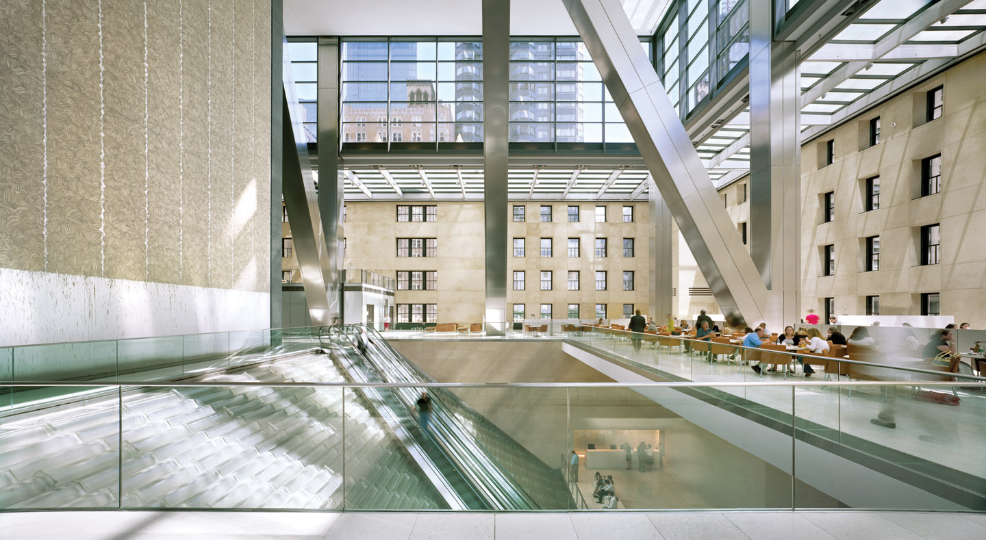
The brief: When International Magazine Building in Manhattan first opened in 1928, the six-storey structure was intended as the base of an Art Deco skyscraper. The Great Depression meant a wait of 75 years before construction carried on, this time in the form of Lord Norman Foster’s sweeping 46-storey diagonal grid, rendered in metal and glass. With its sleek angled exterior surface, Foster’s tower seems to float over the more intricate and earthy base, which houses a massive lobby and escalators that glide atop a three-storey waterfall. William Randolph Hearst commissioned the original building as the headquarters for his global publishing empire and it remains as such; magazines such as Elle Décor, Popular Mechanics and Esquire are still produced here. Of course, the advent of digital media means that the building’s floor plate now includes a broadcast studio and the Good Housekeeping test kitchens. But it’s not just the tower’s diamond façade that’s awe-inspiring; it required 20 per- cent less steel than a conventionally framed structure.
FONDAZIONE PRADA MILAN
Years built: 1910, 2009-Present (First Phase Opened in 2015)
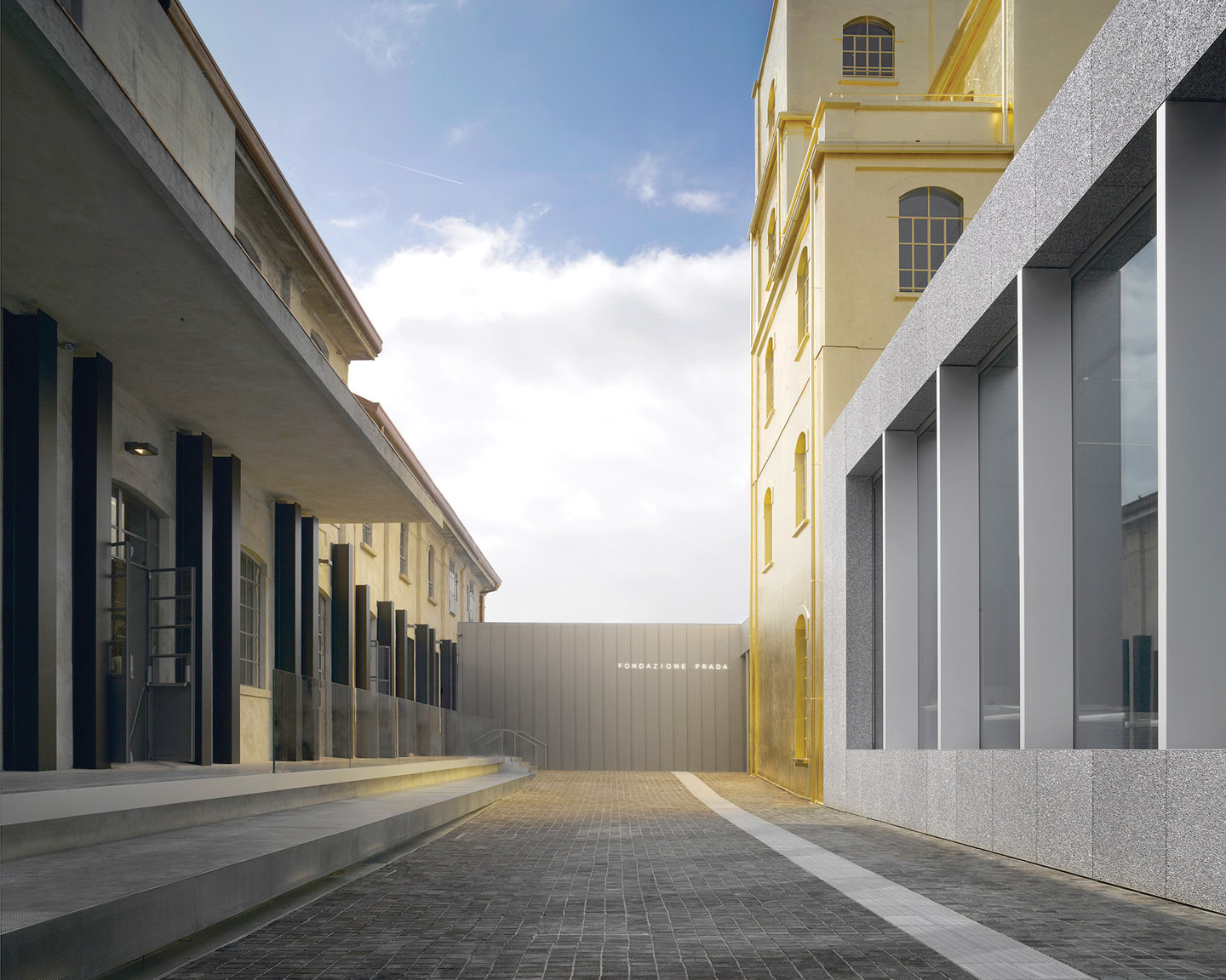
Architects: OMAThe brief: In transforming an early-20th-century gin distillery into an elegant multipurpose exhibition and performance space, architect Rem Koolhaas conjures up a new Gilded Age — literally. The four-storey structure at the heart of the 10-building campus of Fondazione Prada Milan is painted in 24-carat gold leaf. Despite its shiny surface, the detailing on what’s been dubbed “the haunted house” cleverly matches the utilitarian pre–World War I distillery buildings around it; the building’s both a show-stopper and a team player. An angular nine- storey tower, which will display the foundation’s permanent art collection, stands guard over the campus, its clean modern design making its architectural mark in an otherwise gritty industrial neighbourhood. But not everything about the space, established by the Prada family, reflects the legendary fashion house’s unfussy clean-lined aesthetic. Bar Luce, designed by U.S. filmmaker Wes Anderson, recreates a typical Milanese caffé with twee doll-house joy.
By Paul Gallant – *This article originally appeared in INSIGHT: The Art of Living | Winter 2017
Photos: Tim Fisher; Héléne Binet; Patrick Bingham-Hall; Dieter Schewig/Newscom; Nigel Young/Foster Partners; Fondazione Prada/Bas Princen


