

5 Simple Ways to Make Your Home Cozy This Winter
Style & Design
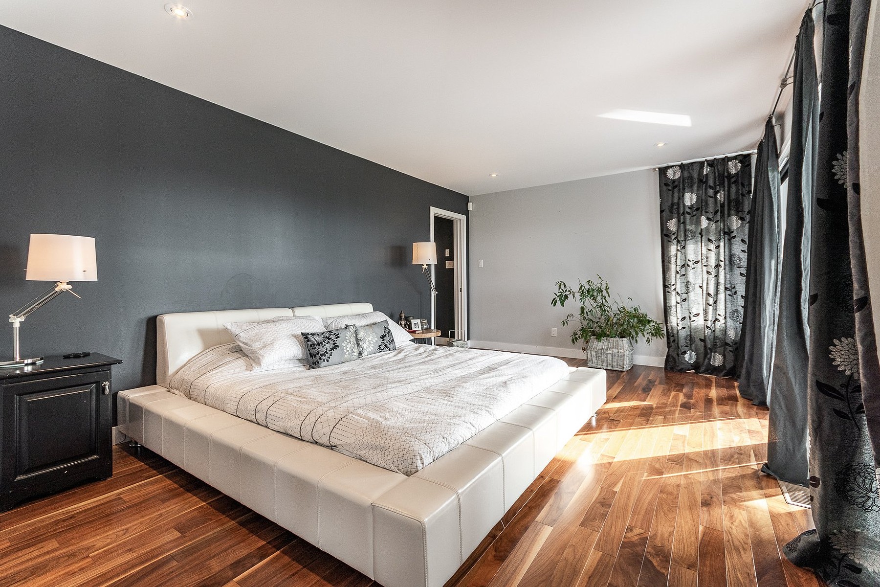
The living room is the heart of your home, and it’s also your most versatile space. While kitchens are for cooking, dining rooms are for eating, and bathrooms and bedrooms are self-explanatory, the living room is the only space dedicated entirely to relaxation and enjoyment—whether that’s decompressing with a good book or entertaining company.
Whatever your vision for your living room, the right colour choice will help you make it a reality. Here are seven colour trends we’re seeing in this year’s designs that can add current yet timeless appeal to your favourite haven.
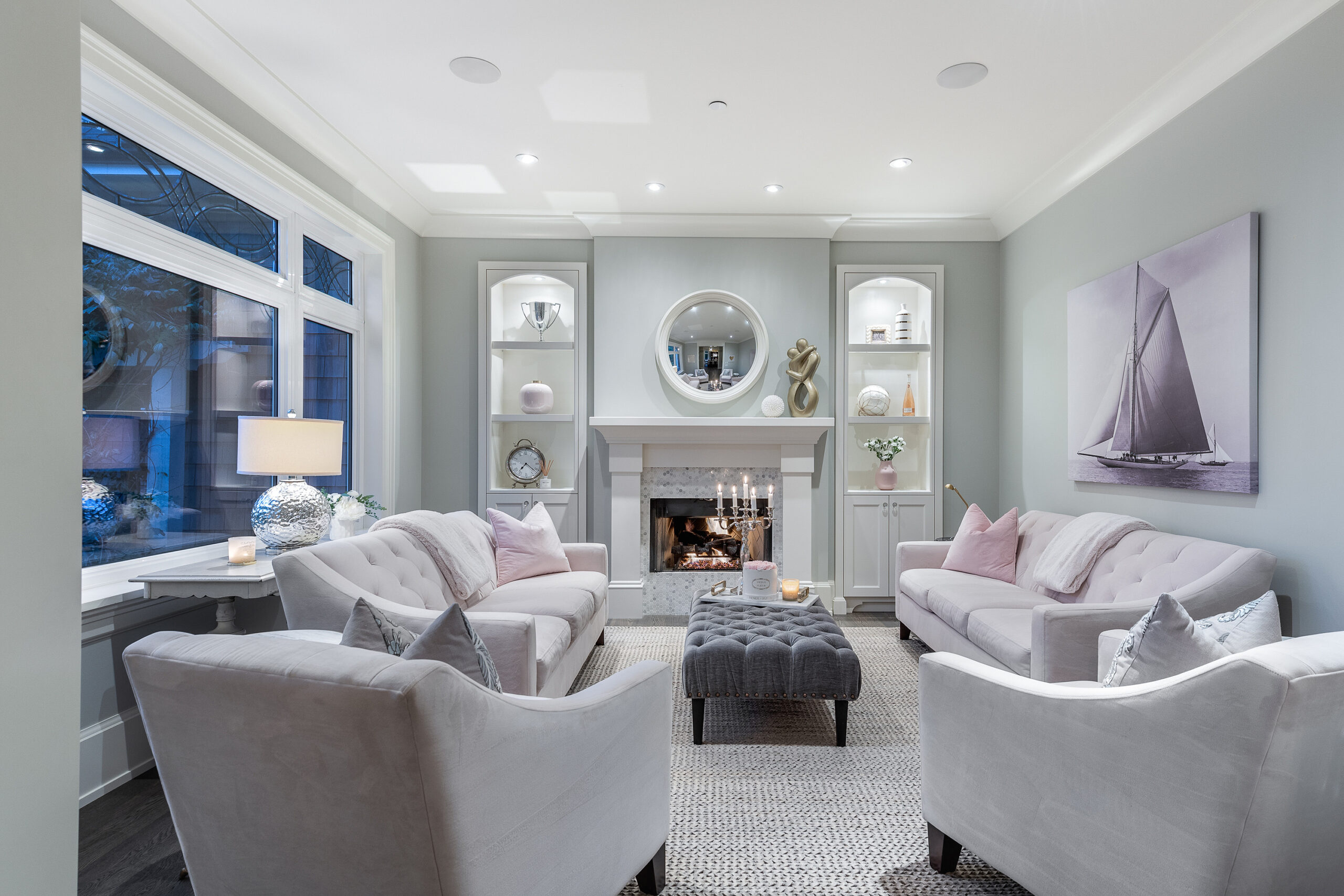
Pale Pink
Pale pinks are striking a chord by contributing pops of warmth and vibrancy to spaces while remaining nearly neutral. Whites, beiges, and browns work beautifully enlivened with pastel blush. Muted pinks finding their way into living rooms lately, whether in plush armchairs or matte walls. The understated softness and calm of faded pink can also serve as a balanced counterpoint to more audacious accents like bold patterns or heavy black.
Royal Blue
Like faded pinks, soft blues are a favourite for lovers of neutral colours. Heathery blues go well with grays and blacks, as well as off-whites such as beige and taupe, adding a cool glamour to what would otherwise be a minimalist palette.
This year, however, we’re seeing royal blues making a statement in living rooms. These are dynamic, refined shades of azure that can be rich and jewel-bright, or as delicate as the sky just before evening. Choose a blue depending on whether you want your living room to be deeply immersive and intimate, or open, spacious, and chic.
Immersive Teal
Regal teals that mix blue and green are gaining popularity in living rooms this year as well. Teal encompasses a variegated spectrum, with aquatic cerulean tones on one end, and malachite and viridian on the other.
Brilliant peacock blue and hunter green are perfect examples of the many places teal can go. Peacock blue is at once classic and on-trend for living rooms, with a remarkable capacity to coordinate with neutrals or contrast with warmer accents such as orange, pink, and gold. Hunter greens with blue undertones are being used by designers to evoke the freshness of nature.
Far from the bright blue-greens of turquoise or robin’s egg, these darker shades help to both elevate and energize a living room with a sense of grandeur and dramatic flair. They add plenty of personality—one that is equal parts elegant and fun.
Verdant Green
As with teal, greens that conjure the freshness of vegetation are still trending this year, and they’re certainly not going anywhere. Among the colours of the visible spectrum, green is often cited as one that inspires feelings of relaxation and peace due to its similarity to the great outdoors—perfect for a living room.
There are two “garden variety” greens that are proving to be a top choice for living rooms this year. Olive green is a perennial favourite for walls and furnishings because it is both vivid and natural. Use it as an unostentatious complement to neutrals, millwork, and moldings, or make it a commanding statement. Mint green is also popular; it’s a paler option that goes well with other colours as both a natural shade and tasteful pastel.
Citrus Yellow
Orange is a colour beloved for simulating sunshine and instilling an optimistic outlook, which is why it’s being chosen for living rooms this year. The trick comes in selecting a shade that’s not too brown nor too bright.
A muted yellow-orange strikes a happy medium. Use it to create a visual statement in a single area of your living room, or disperse it throughout the space with a colour that contrasts. Peacock blue and mint green are two excellent partners for citrus tones.
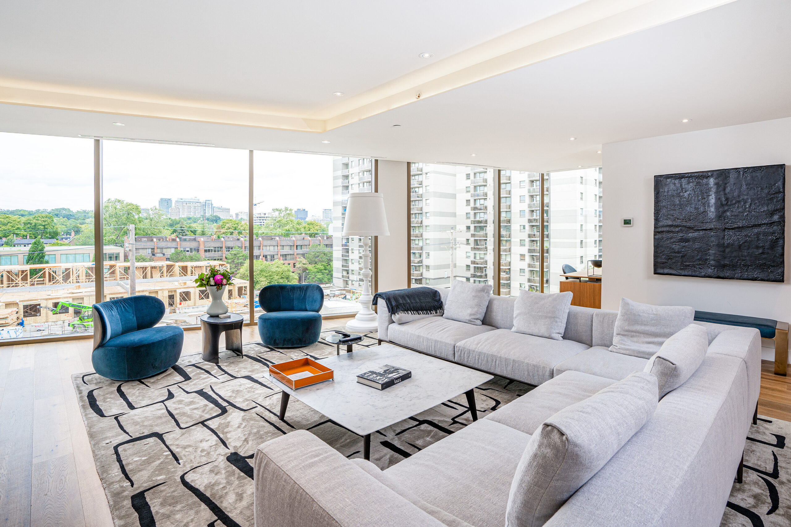
Gray-Blues and Purples
Some of the best tones for living rooms exist in the blue-violet region of the gray spectrum. The lighter end of this palette includes pale, ethereal colours like periwinkle on the blue side and lavender on the purple.
Gray has a reputation for making spaces seem cool, but with the right mix, they can turn out to be quite warm and welcoming. Gray tones invoke a sense of creativity, serenity, and luxury, and mark your living room as a tranquil space where you can always seek sanctuary and peace of mind.
Statement Black
It should come as no surprise that black is a recurring trend in living rooms this year. If you tend towards neutral colour schemes in your walls and furniture, you’ll likely find yourself relying on black for any bold, standout features.
Black is an excellent companion to a wide range of colours, which you can employ strategically to ensure your living room doesn’t become too dark. It can also help hide architectural elements you don’t want to draw attention to, depending on the layout of your walls or beams.
Ultimately, it’s called a living room for a reason: this is a place where you should feel fully alive and present, attuned to your surroundings and happy to just be. A good living room is invigorating, restorative, and revitalizing. Choose a trending colour palette to let your living room live up to its name while indulging your senses and welcoming yourself home.
This article was originally published on Sotheby’s International Realty’s Extraordinary Living Blog and has been adapted for Sotheby’s International Realty Canada’s INSIGHT Blog.